

You know your store like your own pocket, it's obvious. You certainly have regular customers who know exactly where to look for their favorite products. However, it is different with those who come rarely or appear for the first time and have to find their way into the new space somehow (especially if they are in a hurry). The only thing that brings them together is you. You want them to come as often as possible and buy as much as possible. But do you have any influence on it?
The good news is, you do. Dive into the world of merchandising, which means "organization of the sale of goods". This is the definition of all activities that lead to the fact that the customer buys more willingly and stays in the store longer. Specialists in this field use the topography of stores, knowledge of marketing, social psychology and statistical data. However, even if you operate on a much smaller scale, you can apply solutions developed by them. Start by doing your own "research".
Look around the store and observe how customers move around it
In the best designed stores, the customer path has been carefully planned. It runs counterclockwise. Customers enter the room and, maneuvering between successive aisles, turn left and end their journey at the cash register.
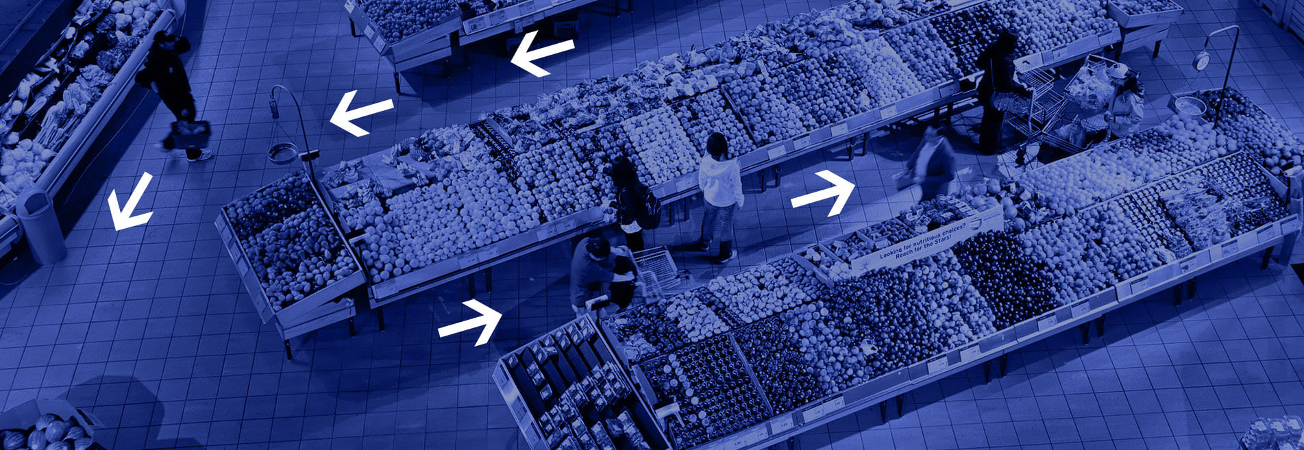
In each store we find the so-called "dead zones". These are places that customers avoid. Most often, such zones can be indicated in the vicinity of the store entrance, room corners and extreme parts of shelves. Knowing where your store's weaknesses are will help you make better use of them.
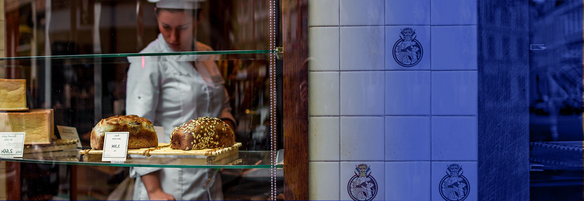
Think of your shop exposition as your business card
The exposition often makes new customers visit us. In turn, regulars know that something new is waiting for them. The decor of the exposition should change every 2 weeks. The most effective are those prepared on the basis of the theme. These can be, for example, holidays, special promotions or seasons.
Take care of the client's well-being
Start introducing changes following the „from general to specific” method. Our overriding goal will be to make customers feel good in the store. Thanks to this, they will shop longer and more willingly come back for more. Start with:
Help with choosing the best products
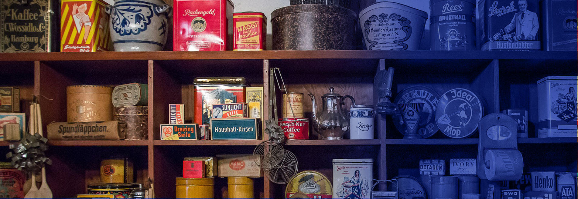
Large stores use various solutions to guide customer decisions. They do it cleverly because modern consumers do not like manipulation and quickly notice that someone is trying to stretch them. Therefore, it is worth using those behaviours that are “natural” to us. For example, most of us follow the "right hand" principle when shopping. This means that we are watching the goods on our right side.
We look at the contents of shelves and displays a bit like reading a book - starting from the left side (specifically from the upper left corner) to the right. The most attractive goods should therefore be placed on the left side so that the consumer will quickly notice them.
In turn, when we walk the aisles, we most often choose the goods that are in the middle of the shelving. We avoid its ends (so-called "dead zones"). This is because at the beginning of the aisle we don't want to make a purchase decision yet. At the end, we usually already have a selected product from a specific category in the basket. Naturally, the best products are better placed in the middle.
Products from the same category should be next to each other. We put a complementary assortment nearby. Grouped products that differ in quality and price should be arranged so that the average price and quality are at the customer's eye level. Put the cheapest assortment on the lowest and the most expensive products on the highest.
Sale can also be improved by various types of hangers and posters that distinguish current promotions. They should be at the customer's eye level. However, remember not to have too many of them. Instead of boosting sales, you can get a chaos effect in which it is difficult to make a decision.
Engage all of the customer's senses
he best stores don't just focus on what the customer sees. Whole customer experience is also influenced by:

Experiment
Sometimes even small changes in the arrangement of products or the appearance of the display can affect the behavior of customers. Therefore, observe what is happening in your store and react to the behavior and opinions of your customers. For example, if most of your customers are elderly, choose lower and well-lit shelving. Introduce changes gradually, so that regular customers do not get discouraged to their favorite store.